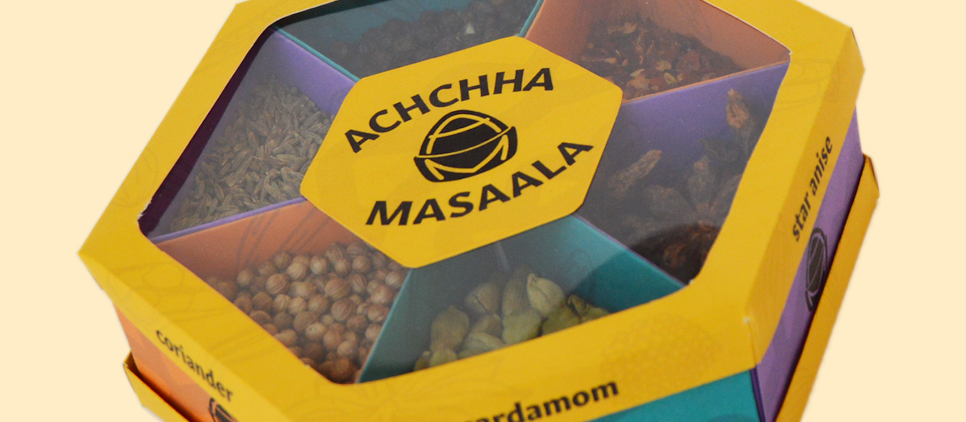
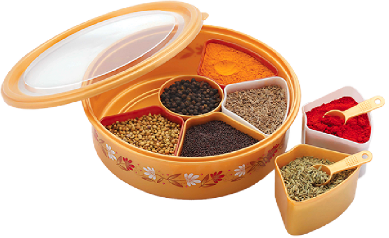
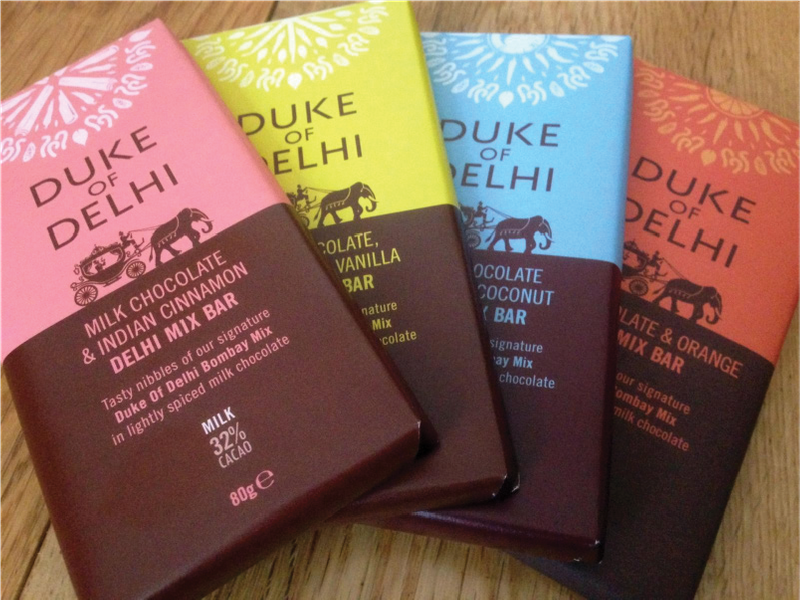
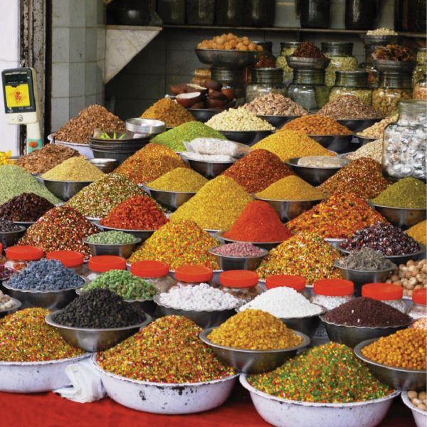
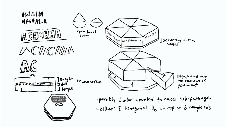
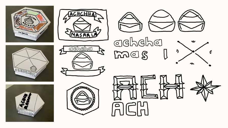
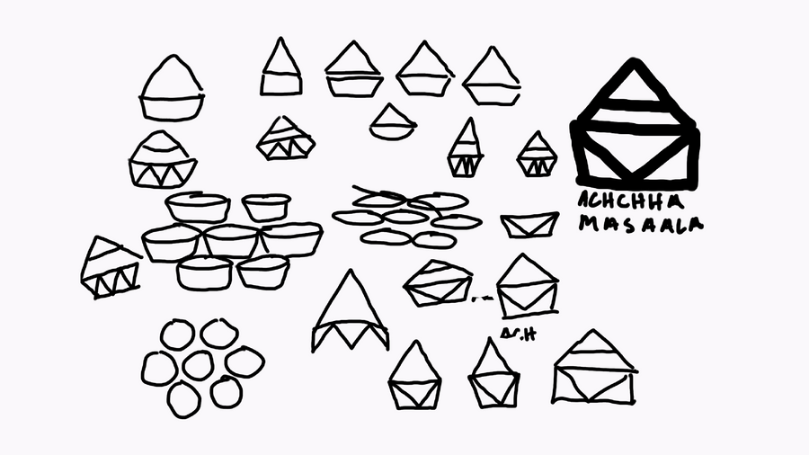
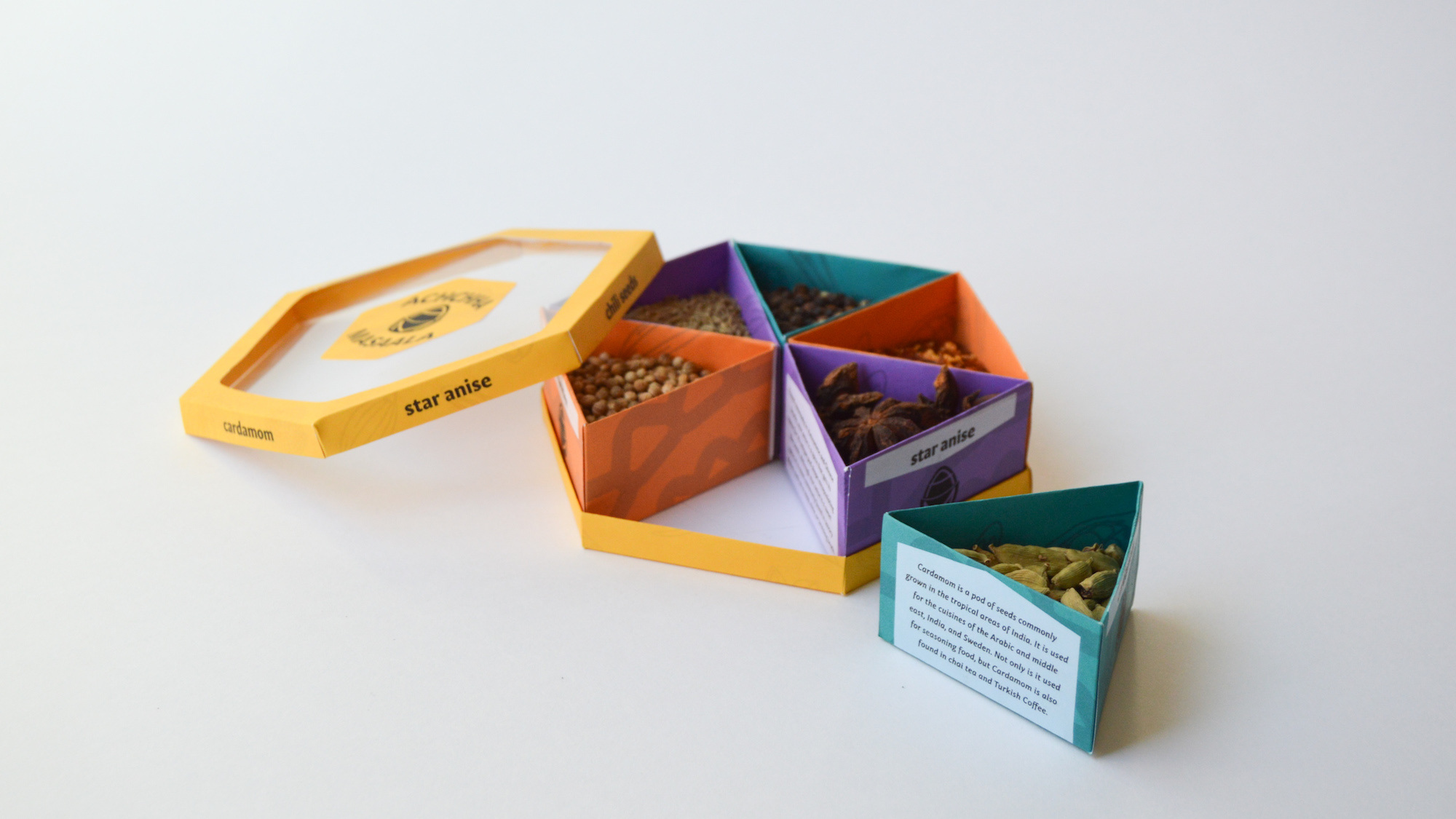
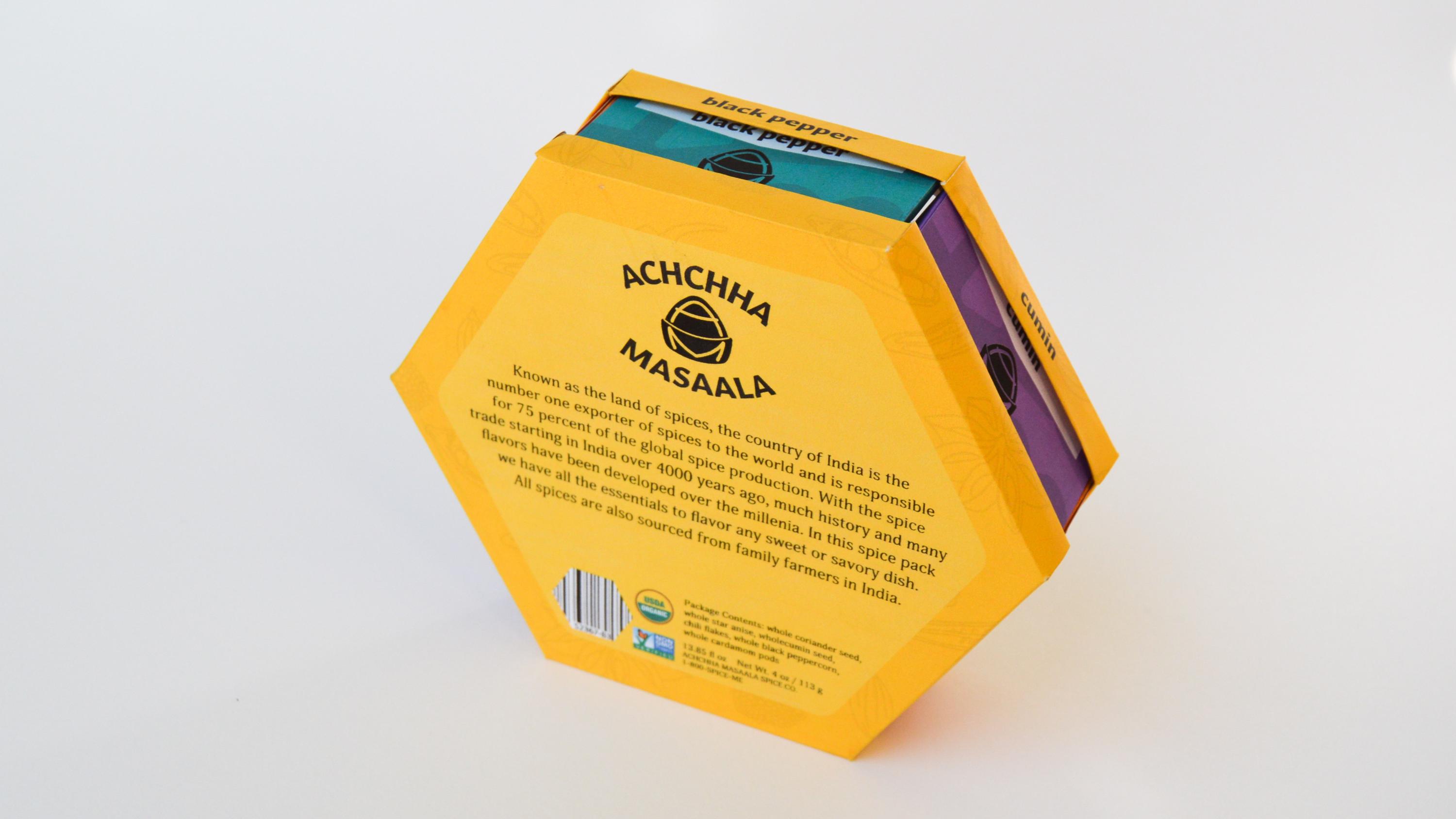
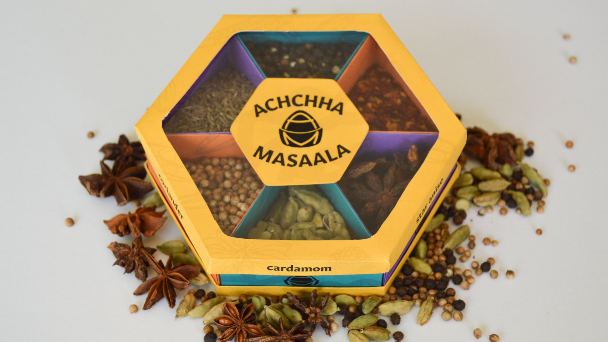
I began my research by looking at areas of design that align with this package’s brand identity. Because of my project’s spice approach I looked at the world’s largest spice supplier in the world for inspiration: India. I carefully selected aspects of the spices and surrounding collateral for inspiration, but made sure not to inaccurately represent the culture. I drew great inspiration from masaala boxes. I never knew about these boxes before this project but just learned that the perfect solution already existed. I was inspired by the see-through quality of some masaala boxes, and the way they compartmentalized.
TRANSPARENT
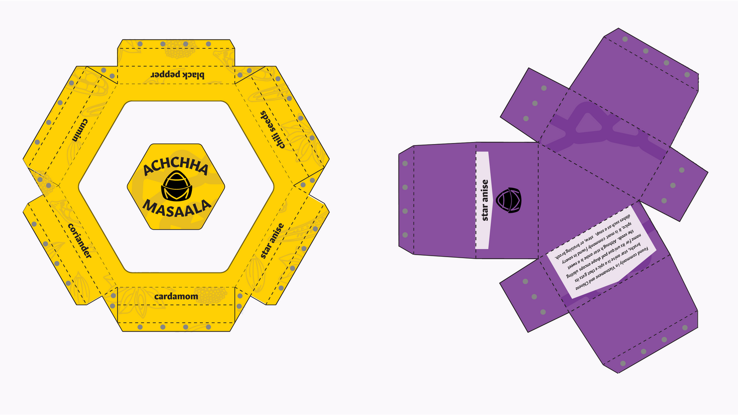
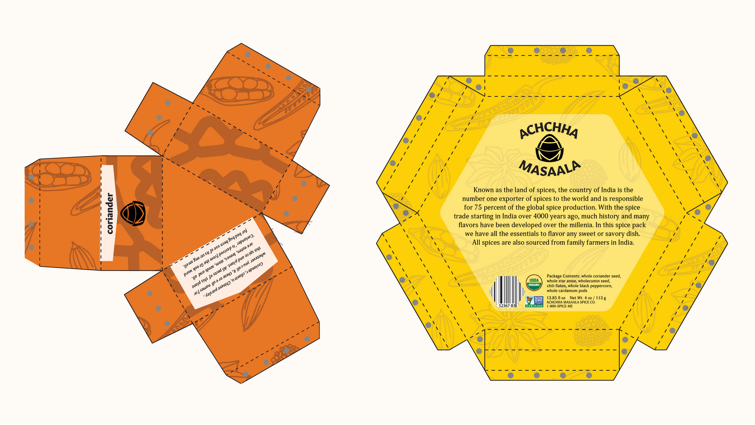
SUB-PACKAGING
CULTURALLY INSPIRED
CULTURALLY INSPIRED
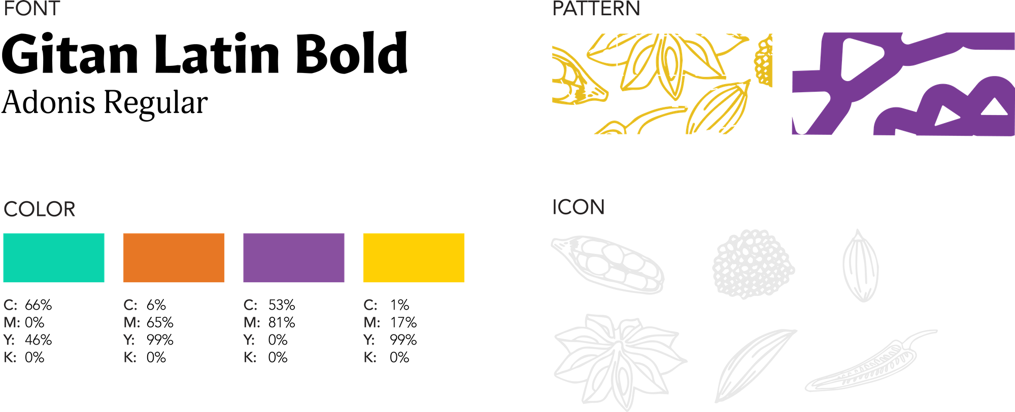
COLOR
SPICE COLORS
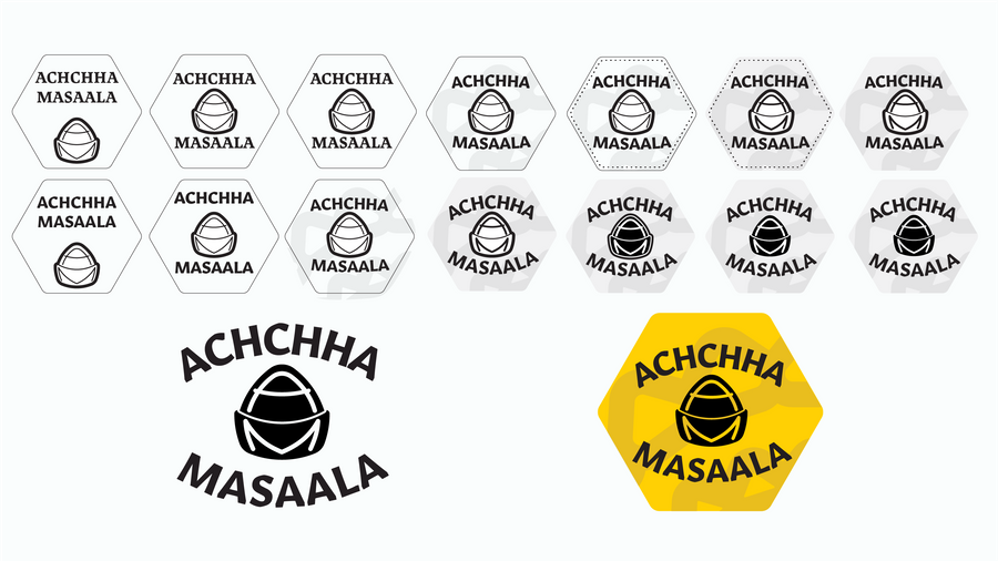
Identity:
For my identity I drew inspiration from imagery of a spice basket that one might find in a market. The ‘A’ and ‘M’ lent themselves to this logomark well. This logo can scale from the patch lock up to just mark and type, to just a mark. I had a lot fun creating this logo. The imagery nature of the mark as well as how I was able to fit the initials in was a fun challenge that I thought of a good solution to.
System Definition:
Triangles and hexagons were an important shape in this project. Almost every aspect of this design has been affected by these shapes. From the start of this process I knew I want- ed to use bright colors that are common within India. When I picture the colors found in India I think of vibrant and saturated dyes and colors. I did drawings of the spices in the package for a good pattern and texture to wrap certain areas of my project in low opacity.
Creation:
My goal when creating the design for this packaging was to highlight the bright colors of the Indian spice markets, showcase the unique spices that this product offers, and be an educational source for those that buy this product. A challenge that I faced in designing this product was how I would portray the spices.