Tandem
weekly planner
naming, brand identity, layout
illustrator, indesign, photoshop
Naming, designing, and branding a weekly planner and surrounding peripherals.
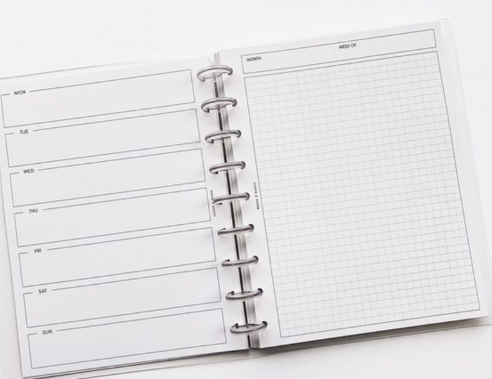
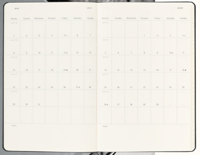
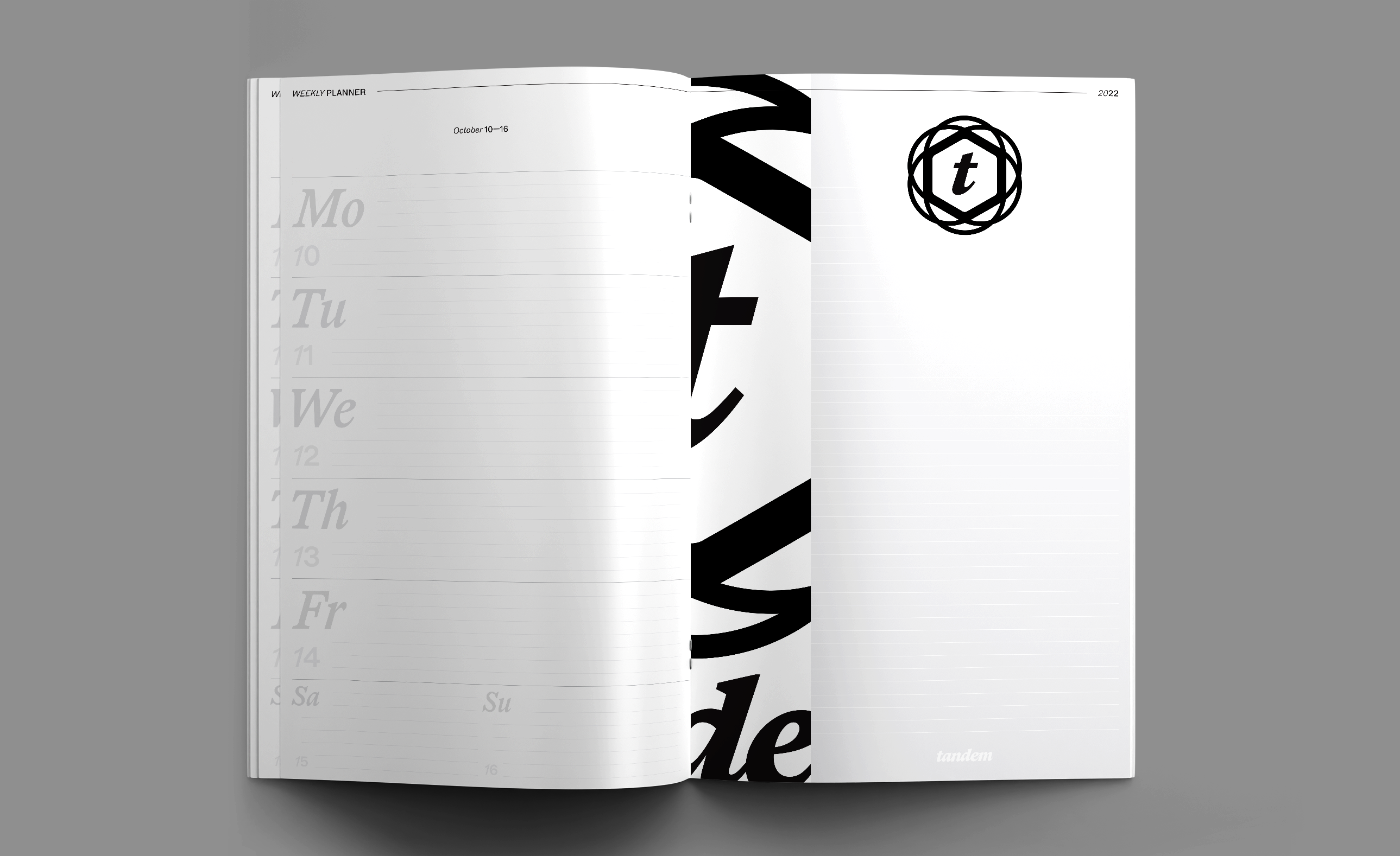
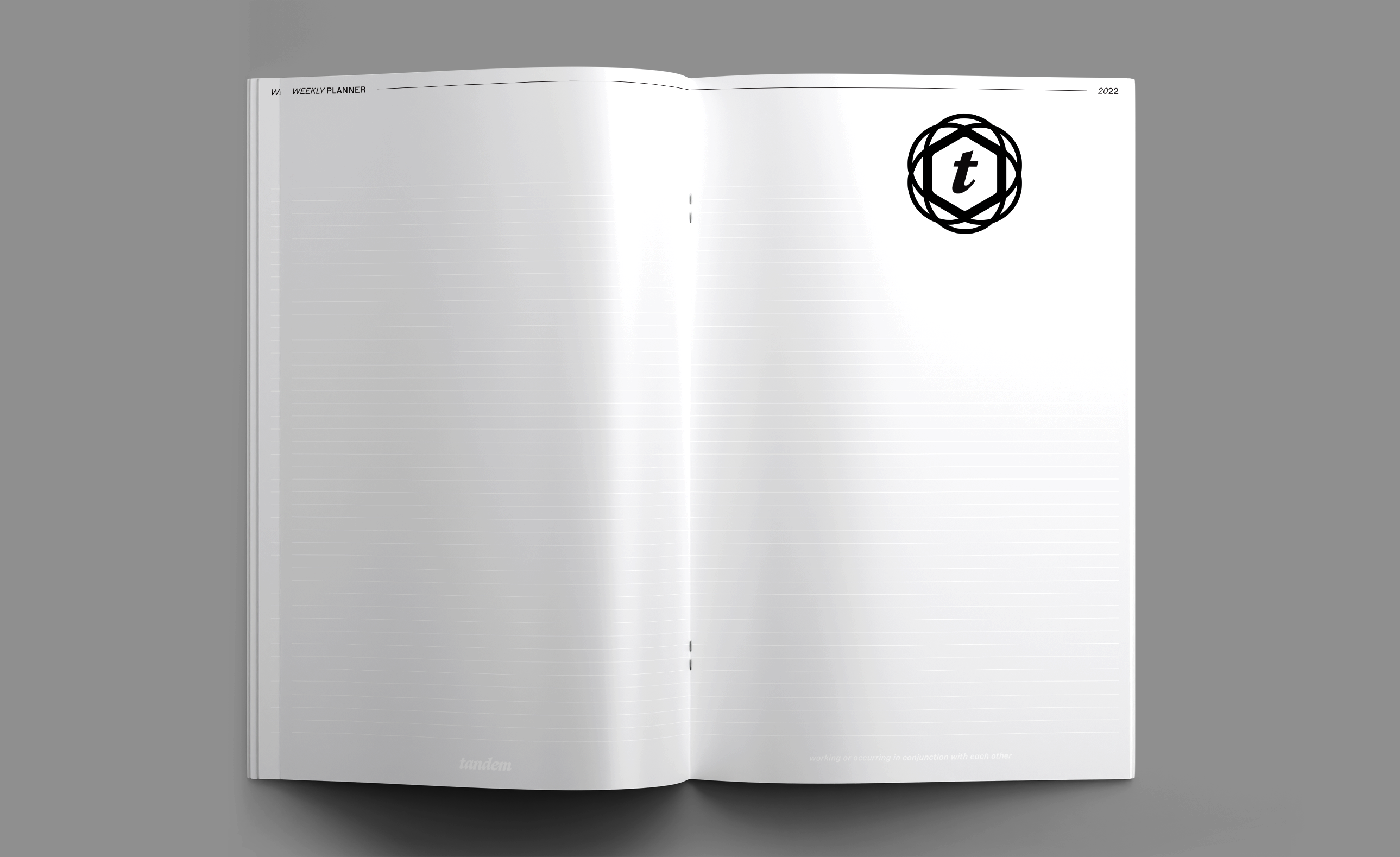
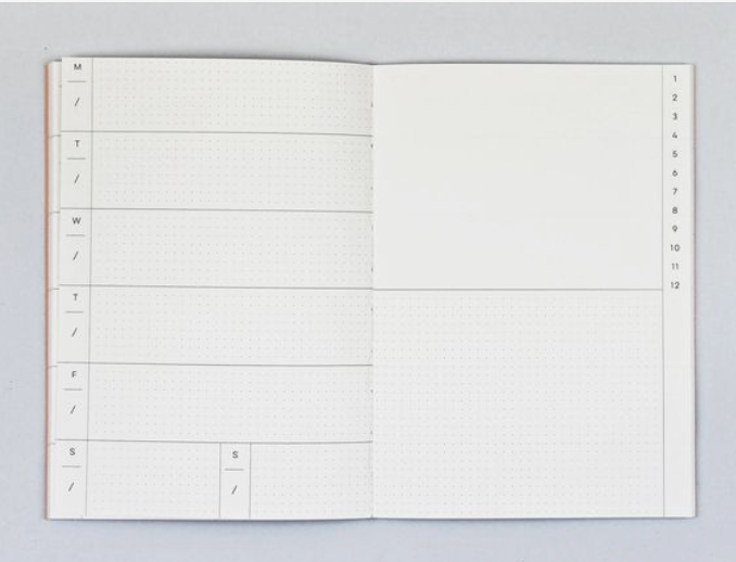
I began my research by looking at layouts of planners. I settled on a weekly planner with a note section. Each spread would contain one week and a dedicated area for any ideas or notes I have that week. The goal of this planner is to replace using my notes app for jotting down random thoughts and important dates.
type-page relation
layout
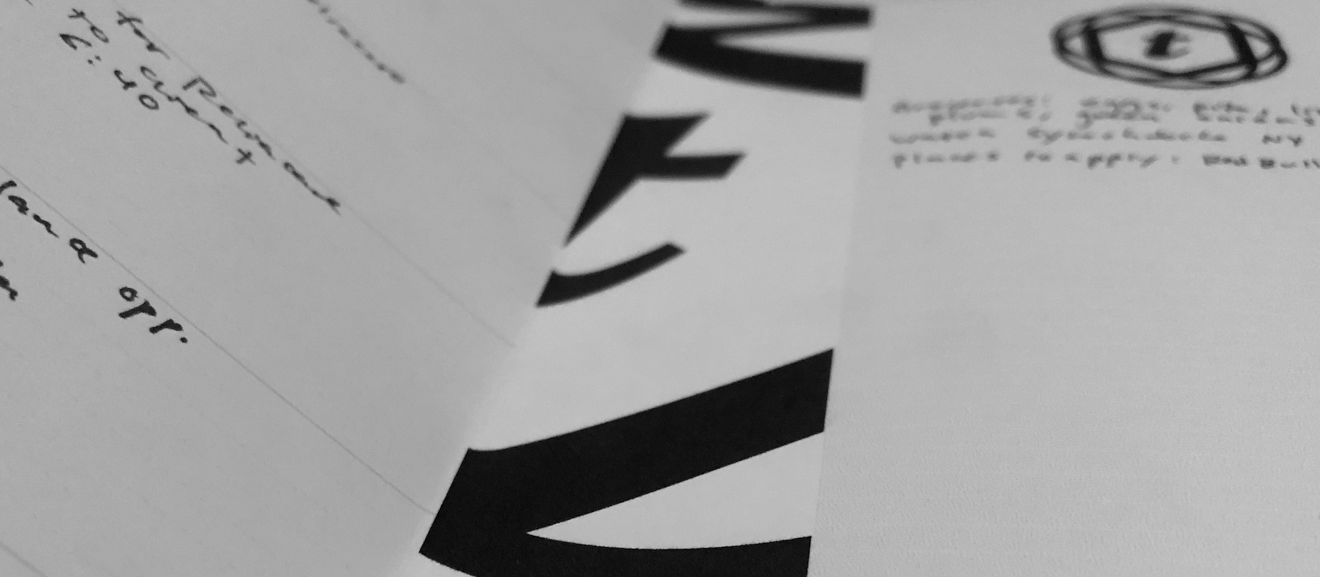
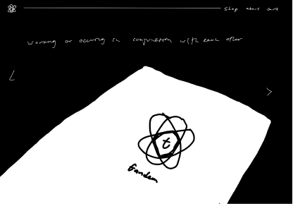
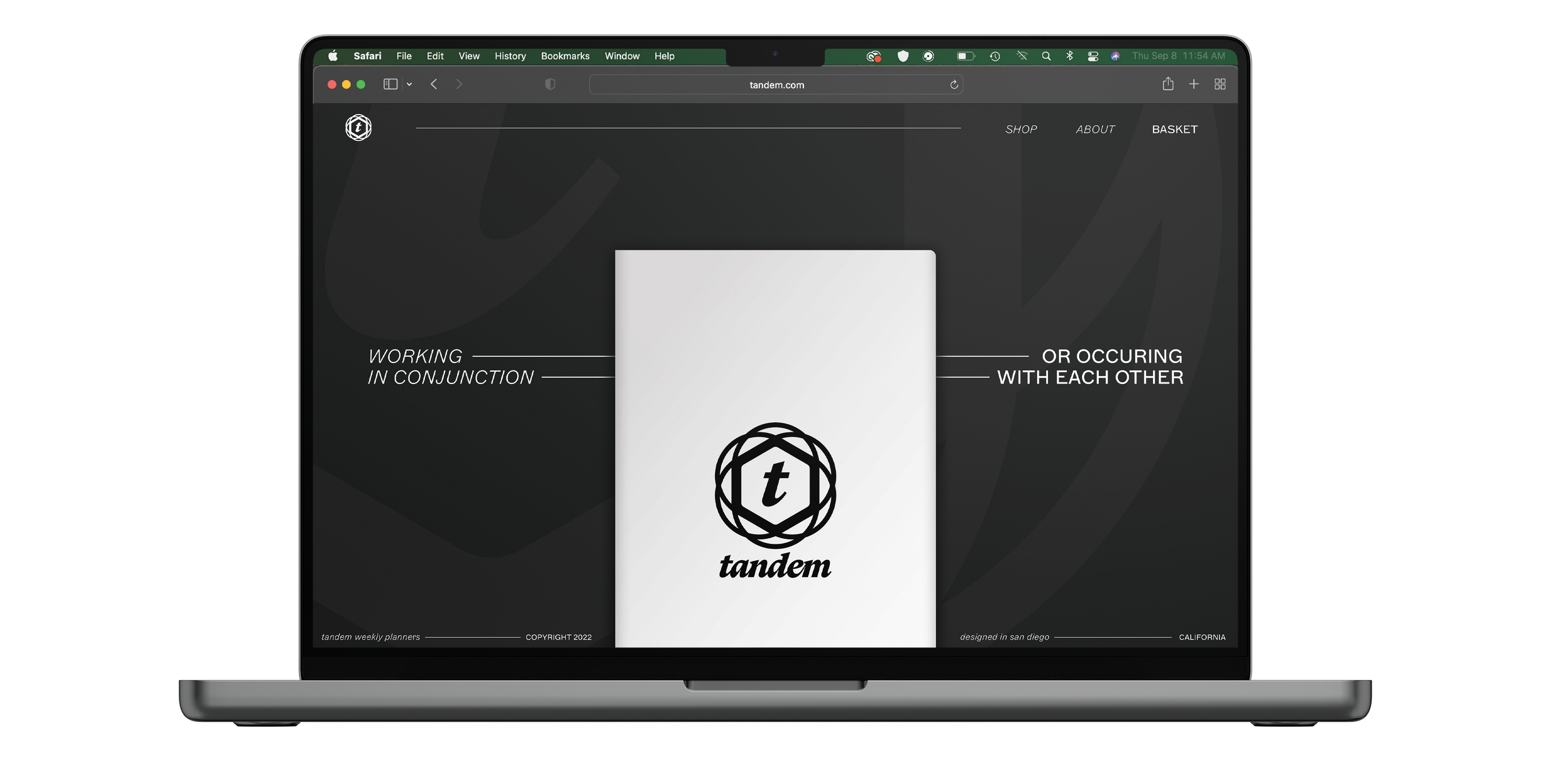
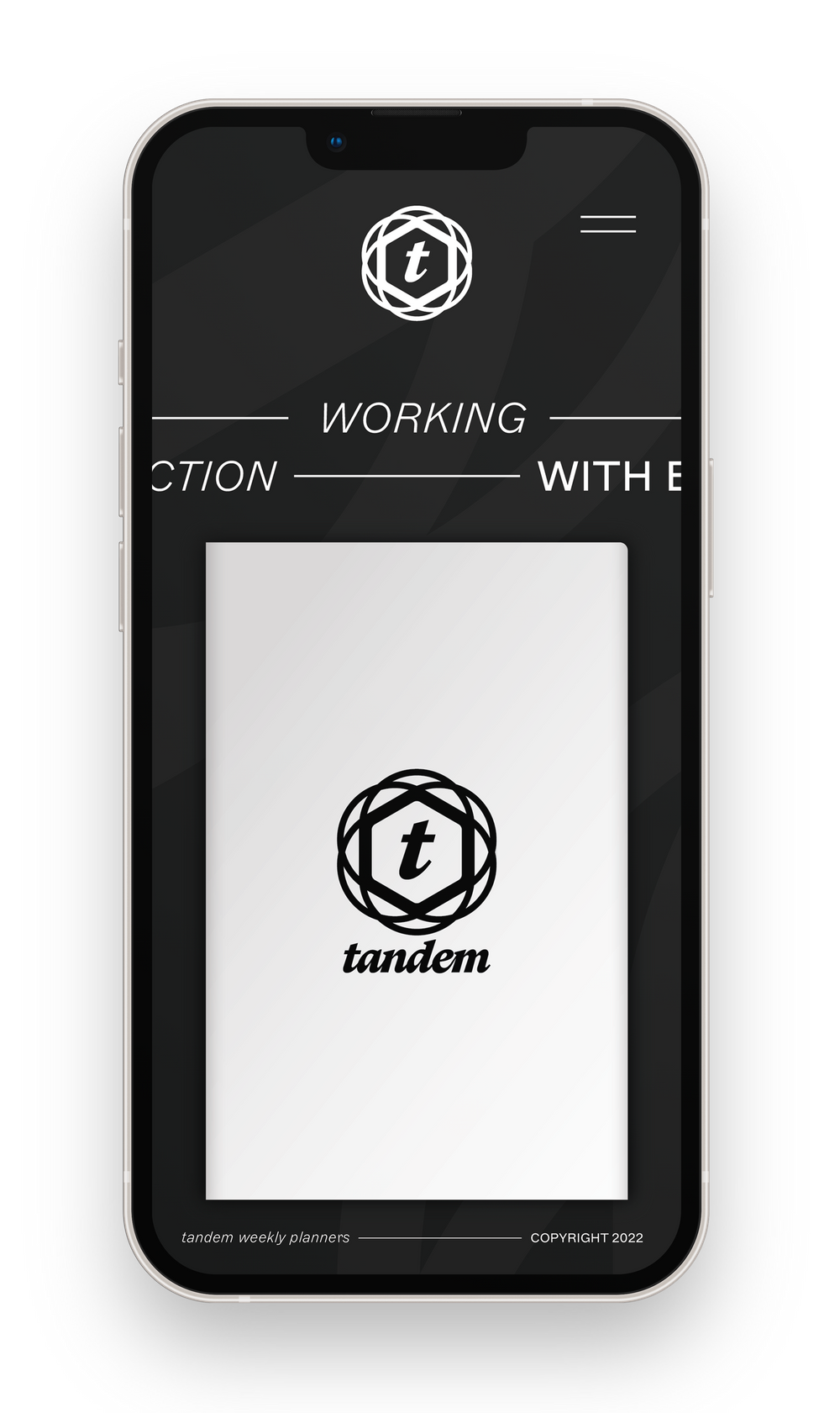
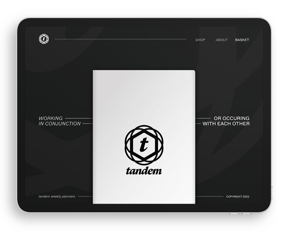
Tandem represents the organization of multiple events and ideas being placed neatly together. The definition of tandem is “working or occurring in conjunction with each other,” and that’s what I hope to achieve with this planner. A place to organize my thoughts and actions into one central location. The logomark represents the many ideas swirling around in my head being arranged neatly and creating a quiet, calm, peaceful mind.
The system of thin, swirly forms becoming solid, sturdy forms are consistent throughout the planner. I chose a reserved palate of black and white to act as a clean slate to write onto, and intentionally chose to use a colored pen to draw attention to my tasks at hand and create a heirarchy of importance.

Material+
Greening Lemon Grove


© 2026 Brian Leenerts. All Rights Reserved.
website BUILT From Scratch by brian leenerts in webflow. Sax typeface paired with inter.